Confused by Pinterest’s visual world? You’re not alone. Many people over 50 avoid Pinterest because they think design requires expensive software or tech expertise. Here’s the truth: creating eye-catching pins is easier than ever with today’s user-friendly tools. You already have the creativity and life experience – now let’s give you the practical skills to shine on Pinterest.
- 1. What Makes a Pin Actually Work?
- 2. Do I Really Need Design Experience?
- 3. Which Free Tools Should I Use?
- 4. How Do I Choose the Right Colors?
- 5. What Font Choices Work Best?
- 6. How Much Text Should I Include?
- 7. Can I Use My Own Photos?
- 8. What’s the Easiest Way to Start?
- Video: How to Create the BEST Pinterest Pins in Canva – A Step-by-Step Tutorial
- 9. How Do I Stay Consistent Without Getting Bored?
- 10. What Mistakes Should I Avoid?
- 11. How Will I Know If My Designs Work?
- FAQ: Pinterest Design Tips for Beginners Over 50
Start Here > Content and Affiliate Marketing > Social Media Marketing > Email Marketing > Video Creation > YouTube Creator > Resources > Reviews
1. What Makes a Pin Actually Work?
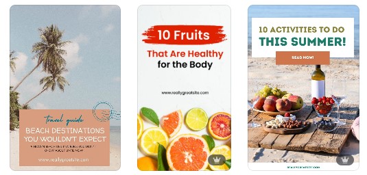
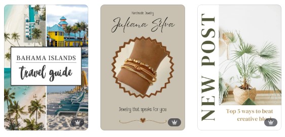
Vertical images win every time. Pinterest favors a 2:3 ratio (1000×1500 pixels), which takes up more screen space and catches more eyes.
Think of your phone screen – vertical images naturally fit better and command attention.
Your pin needs three essential elements:
- A clear focal point
- Readable text overlay
- Brand consistency
The focal point draws viewers in, the text tells them what to expect, and consistent colors help people recognize your content instantly.
2. Do I Really Need Design Experience?
Absolutely not. Modern design platforms do the heavy lifting for you.
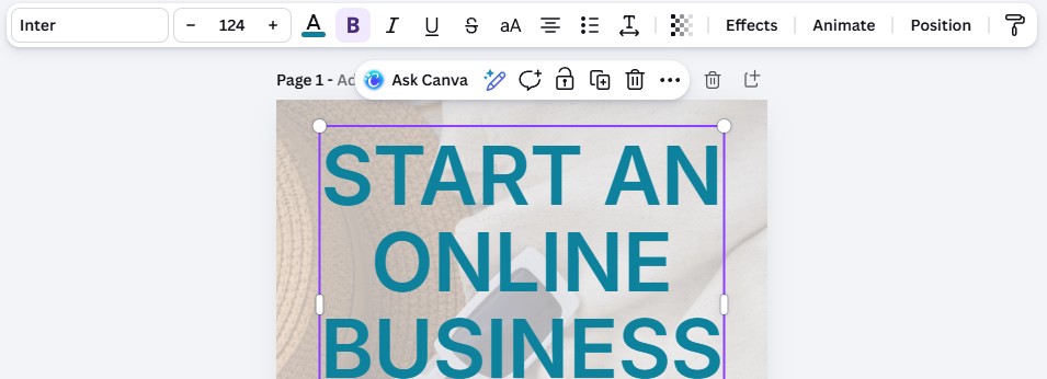
Canva offers thousands of Pinterest templates specifically sized and formatted for the platform. You simply swap in your own photos and adjust the text – no design degree required.
Start with pre-made templates rather than blank canvases. Templates give you proven layouts that already work. As your confidence grows, you’ll naturally start customizing more elements.

3. Which Free Tools Should I Use?
Canva’s free version provides everything beginners need: Pinterest templates, stock photos, fonts, and basic editing tools. The interface feels intuitive – drag, drop, click, done.
Unsplash, Pixabay and Pexels offer high-quality free photos. Search for images that match your topic, download them, then upload directly into Canva. Skip blurry or cluttered photos – clean, bright images perform best.
ColorSpace helps you choose complementary colors. Enter one color you love, and it generates matching palettes. This prevents the common beginner mistake of combining colors that clash.
4. How Do I Choose the Right Colors?
Pick two or three brand colors and stick with them across all pins. Consistency helps followers recognize your content immediately.
- Choose one dominant color
- One accent color
- And optionally one neutral (white, cream, or light gray)
Contrast matters more than trendy colors. Dark text on light backgrounds (or vice versa) ensures readability.
Test your design by stepping back from your screen – if you can’t read the text from six feet away, adjust your contrast.
Consider color psychology:
- blue conveys trust
- green suggests growth
- purple implies creativity
- warm colors like coral create energy.
- Pick colors that match your content’s mood.
5. What Font Choices Work Best?
Limit yourself to two fonts per pin: one for headlines, one for supporting text.
More fonts create visual chaos. Canva labels fonts as “heading” or “body” fonts to guide your choices.
Sans-serif fonts (without decorative tails) read better on small screens. Arial, Helvetica, and Montserrat work beautifully.
Save script fonts for small accents – they’re difficult to read as main text.
Size your headline text at 80-120 points minimum. Pinterest users scroll quickly, so your text must be instantly readable on mobile devices.
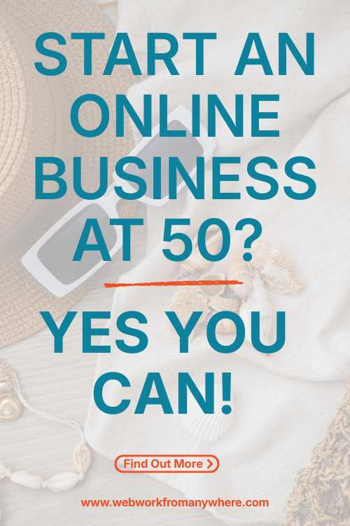
6. How Much Text Should I Include?
Less is more. Use 5-10 words maximum for your main message. Think billboard, not paragraph. Your pin should communicate its value in under two seconds.
Structure text in short phrases rather than complete sentences. “5 Simple Gardening Tips” beats “Here Are Five Simple Tips For Your Garden.” Every word must earn its place.
Position text in the top two-thirds of your image. Pinterest’s algorithm often crops the bottom section in search results, so important text placed there might not display.
7. Can I Use My Own Photos?
Your personal photos add authenticity that stock images can’t match. Today’s smartphones take excellent photos – you don’t need professional equipment.
Improve smartphone photos with these quick fixes:
- tap your screen to focus before shooting
- use natural light when possible
- avoid busy backgrounds
- in Canva, adjust brightness and saturation to make colors pop.
Combine your photos with text overlays and design elements. A simple recipe photo becomes Pinterest-worthy when you add an appetizing headline and a colored overlay with 50% transparency.
8. What’s the Easiest Way to Start?
Before: Staring at a blank canvas, unsure where to begin.
After: Opening a Canva template, changing the photo and headline, and saving your first pin in five minutes.
Follow this beginner workflow:
- Open Canva and search “Pinterest pin”
- Choose any template that catches your eye
- Click the photo to replace it with yours
- Click the text to type your headline
- Adjust colors using the color picker (the A in the top bar)
- Download as PNG
- Upload to Pinterest
This process takes under ten minutes once you’ve practiced twice.
Video: How to Create the BEST Pinterest Pins in Canva – A Step-by-Step Tutorial
9. How Do I Stay Consistent Without Getting Bored?
Create a simple brand kit: save your two colors, two fonts, and your logo in one Canva folder. Each new pin starts with these elements, giving you consistency while allowing creative variation in layouts and images.
Batch-create pins. Dedicate one hour to designing 10-15 pins rather than creating them one at a time. This approach maintains visual consistency and saves mental energy.
Repurpose one blog post into multiple pin designs. Change the photo, adjust the headline angle, and try different layouts. Each variation reaches different audience segments.
10. What Mistakes Should I Avoid?
Cluttered pins perform poorly.
White space (empty areas) gives eyes room to rest and makes your message clearer. If your design feels cramped, remove an element rather than adding more.
Tiny text frustrates viewers.
If you’re squinting to read your own design, your text is too small. Increase font size until it feels almost too large—that’s probably perfect for mobile viewing.
Inconsistent branding confuses followers.
Random color schemes and constantly changing fonts make your pins unmemorable. Pick your style and stick with it for at least 50 pins before considering changes.
11. How Will I Know If My Designs Work?
Pinterest Analytics reveals which pins drive traffic.
Check your top-performing pins monthly and identify common elements: similar colors, text placement, or photo styles.
Double down on what works.
- Impressions show how many people see your pin.
- Saves indicate genuine interest – people want to reference your content later.
- High saves signal you’ve created valuable content.
Don’t expect overnight results. Pinterest rewards consistency over time. Commit to creating and posting 3-5 new pins weekly for three months before judging success.
Wrapping Up: Pinterest Design Tips for Beginners Over 50
You’ve now got the foundation for creating Pinterest designs that attract attention and drive traffic.
Start with one pin today using a Canva template – you’ll be amazed how quickly you gain confidence.
The Pinterest audience appreciates authentic, helpful content over flashy perfection. Your unique perspective matters more than design expertise.
Next Steps: Check out our guide on “Pinterest SEO Basics for Beginners” to ensure your beautifully designed pins actually get found.
FAQ: Pinterest Design Tips for Beginners Over 50
Do I need to pay for Canva Pro?
Not initially. Canva’s free version provides everything beginners need. Upgrade to Pro only when you need additional templates, the background remover tool, or brand kit features. Most successful Pinterest users start with free tools.
How long should I spend on each pin design?
Five to ten minutes once you’re comfortable. Your first few pins might take 20 minutes as you learn the tools. Speed increases naturally with practice – don’t sacrifice quality rushing through designs.
Can I use the same pin design on multiple platforms?
Pinterest’s vertical format doesn’t work well on Instagram or Facebook. Create platform-specific designs instead. However, you can adapt your Pinterest brand colors and fonts across all platforms for consistency.
What if my niche doesn’t seem visual?
Every topic has visual potential. Financial advice uses charts and infographics. Writing tips can showcase quote graphics. Business coaching shares step-by-step process diagrams. Focus on making complex ideas visually simple.
Should I include my face in pin designs?
Personal photos build connection, but they’re optional. Test both approaches – some audiences respond better to faces, while others prefer product photos or graphics. Let your analytics guide this decision.